This article introduces the work we carried out after being consulted by Ace Co., Ltd. on the renewal of their Rakuten Ichiba store. We can only provide a portion of the information, but we will share with you, speaking with Kitayama, the person in charge, about the issues they found in this renewal project and the corrections they made.
The reason for the renewal of the Rakuten Ichiba store
For this renewal, ACE's current website was created quite some time ago, making it difficult to update and making it difficult to focus on Rakuten Ichiba. As a result, they asked us to propose and create a design that would accommodate the Rakuten Ichiba store's new smartphone TOP, make updates easier, and lead to sales.

Kitayama: Since the ACE online store opened on Rakuten Ichiba, we have not been able to allocate resources to it due to various organizational changes and our focus on other sales channels. Sales have increased since we assigned a dedicated person in 2022, and we were thinking of ways to give it another boost.
It has been over 10 years since the site opened, and although a partner had renovated it once, the pages were still old and had not been properly maintained. We felt we had reached our limits, and in order to focus on the future, we wanted to rebuild the site to take into account not only sales but also operational aspects, so we consulted with Commerce Media, the company that manages and produces Rakuten Ichiba.
Issues identified through site analysis
In order to propose a design, we first analyzed the site and identified three major issues.
- Because there are so many products, the categories are cluttered and it is difficult to find products.
- The Rakuten app is designed to provide a strong link to the top page, but the necessary information is not displayed on the top page.
- There is a bias towards certain categories that sell well, but even within those categories, there are some that have weak leads.
While resolving the three issues above, we came up with a structure that would make it easy for users to approach the projects taking place on Rakuten Ichiba, and we devised a design that was in line with ACE's operational methods so as not to require too much operational effort.
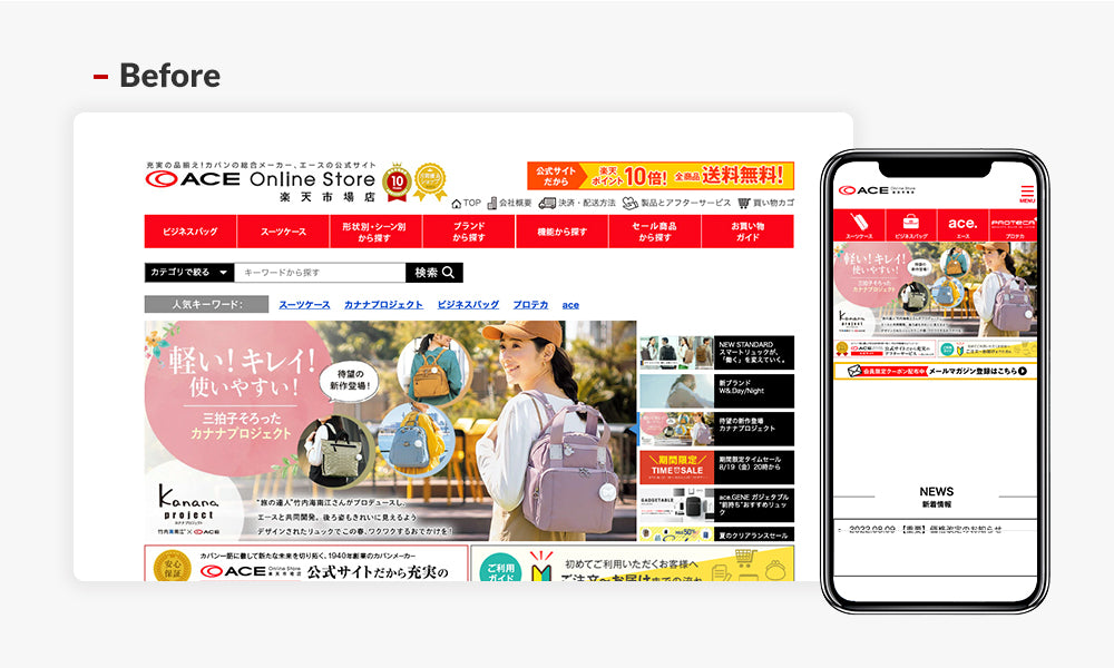
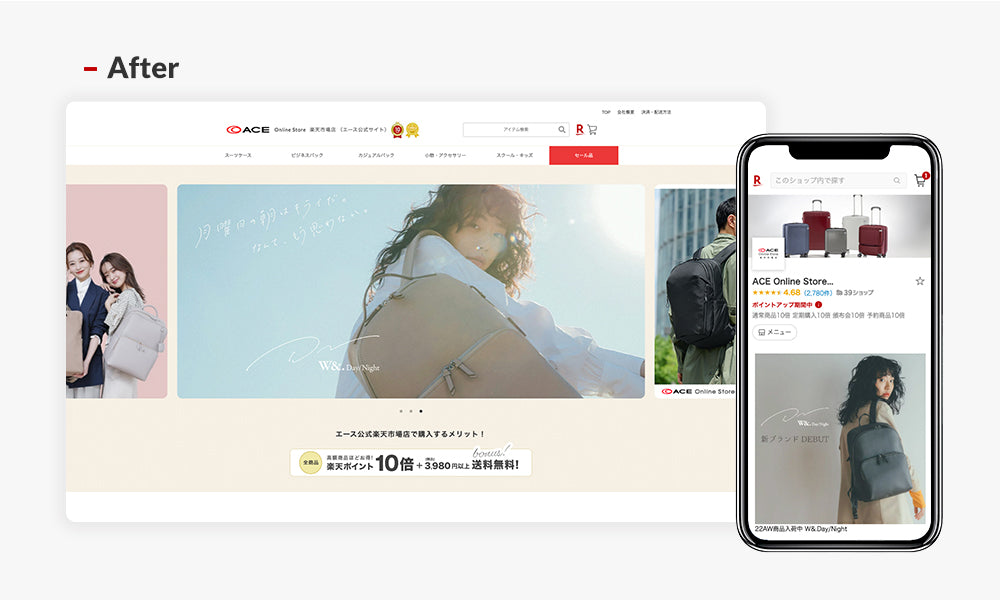
* Compatible with the new smartphone top page
Kitayama-san: First of all, Rakuten Ichiba is known for its busy pages, and while many stores have pages that are difficult to navigate, I fell in love with the smart design of this official store at first sight. Each section was explained to me carefully, and I was completely convinced. Compared to previous pages, the page has a more meaningful flow and I'm sure it will become a lively page.
Improvements
There are four main improvements we made while refining the overall design.
Organizing categories
In cooperation with ACE, we have streamlined over 500 categories into about 50. In addition, for popular categories, we have made improvements with an emphasis on usability, such as displaying the navigation of lower-level categories on the smartphone homepage.
Since suitcases and business bags were a very large category in terms of sales and searches, we created a design that displayed the second and third levels in parallel on the top page to take up a large surface area.
Rakuten has a strong flow to the top page, so they have a simple design that makes it easy to search without displaying unnecessary content.

Conductor Design
For categories other than suitcases and business bags, we simplified the navigation by selecting products based on the number of hits and within each category.
In addition, we created a section that gathers the products we want to sell and promotional pages at the top, strengthening the flow of the top banner and directing users to the targeted pages.


Organizing content
Considering future operations and ease of maintenance, we have placed emphasis on displaying standard content and popular products that are unlikely to change. In addition, the size of the banner has been designed to match ACE's production system and to minimize the need for resizing or image modification.

Viewing Sections
The new smartphone TOP tends to be a flat site with many restrictions, but by clearly dividing the sections, we have differentiated the content. In addition, by not including more information than necessary, we have designed it to prevent users from abandoning the site and encourage them to browse.

Kitayama-san: This website was packed with content to help us solve our problems. There were some things that only someone who knows how to operate could notice, and I thought, "That's what you'd expect from Commerce Media." Also, our requests were properly conveyed and received, and I was impressed by their excellent listening skills.
It felt like our sales had hit a plateau, so I thought this would help us move up to the next level.
Renewal contents other than the top page
In addition to the top page, we have also updated the information on the review campaign, after-sales service information, and email newsletter registration information pages, and have revamped the design to be simpler and with less text, with smartphones in mind.

In addition, we have created a manual for updating the site so that it will not become a mundane operation after the renewal. This will allow us to create an environment that will make it easy to take over even if there are any changes in the organization in the future.
Kitayama-san: This time, we have reviewed the structure of the site, including the front end. This will increase the number of visitors to the product pages, but if the content is not good, it will cause users to leave the site.
In the future, we will need to transform the store into one that conveys the appeal of each product and piques the customer's interest, and this is what we will do. We plan to rotate staff on a regular basis and work on this EC as a team, rather than relying on a single individual. The reason is that even if there is a main person in charge, there are ideas and measures for each person involved, and there is potential for increasing sales. For this reason, we think it is important for team members to have experience not only with the Rakuten Ichiba site, but also with all other stores, including Yahoo and Amazon, and ease of maintenance was also an area that we could not compromise on.
This time, we were particular about simplifying the overall site structure, making it easier to maintain, streamlining categories, and creating a design that would accommodate the increased traffic from smartphones. The end result was delivered at a quality that exceeded our expectations, and we're glad we chose Commerce Media.
In addition, during the Rakuten Super Sale held after the renewal, we were able to immediately break the Guinness World Record for sales, which made the impact of the renewal very clear.
lastly
ACE's products were very appealing and the store was selling well even before the renewal, but because of this, it was possible that they were missing out on a significant amount of opportunity on their home page, which is key to driving traffic on Rakuten Market.
Furthermore, because the site was old and difficult to update, it was also fatal that a lot of operational resources were required to carry out the project. At Rakuten Ichiba, projects are prepared in accordance with Rakuten's campaigns, which are held several times a month, so there are not many resources that can be devoted to a single project.
We hope that this renewal will contribute even a little to increasing ACE's sales and reducing resources.
If you are having trouble with Rakuten's new smartphone TOP, please feel free to contact us.

